Blog: Colour your Mood - Paint Direct

Next day nationwide delivery*

Shop all the top brands

Supplying homes & trade since 2007

Find 1000's of products

Colour Your Mood

in Colour Inspiration

October 2016
farrow and ball colours
farrow and ball paints
colour your mood

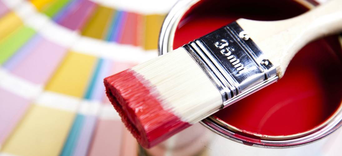
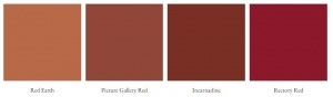
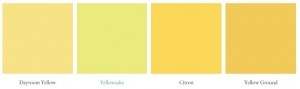
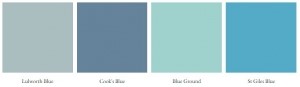
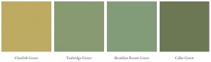
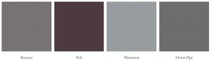
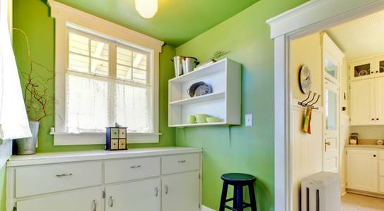
Your colour choices are perhaps the most personal, yet dramatic statements you can make in your home. Believe it or not, colour is a powerful communication tool, and without even realising it, the colours you select for your interior can have a huge effect on the mood you create and the way people experience time in your home.

Your reaction to certain colours can be instinctive, but it is also partly learned from experience and culture. For example, in the West we associate the colour white with innocence, cleanliness and purity, where as in the East, white is representative of mourning and sadness. Yet while our perceptions of colour are subjective, and our reactions to them can vary from person to person and culture to culture, there are some psychological effects of colour that are proven to be more universal in their impact.

Read on to find out more about some of the most mood-enhancing Farrow and Ball colours in your home:

red colours

Red

The colour red exudes intensity, inciting feelings of energy, excitement, passion and strength. Red is thought to stimulate both appetite and conversation, making it a great choice for a dining area, and is known to make rooms feel smaller and more intimate. However, research has shown that due to its equal ability to arouse feelings of anger and hostility, red can increase blood pressure and heart rate, so remember it’s perhaps a colour to be used more for social settings rather than in relaxing spaces.

Try Farrow and Ball Red Paints – Red Earth, Picture Gallery Red, Rectory Red or Book Room Red.

yellow colours

Yellow

This joyful, happy colour is energising and uplifting – reminiscent of the light and warmth of summer sunshine. It can be expansive and welcoming but it is not recommended for use as a main colour scheme due to the fact that too much yellow can apparently cause feelings of frustration, fatigue and even anxiety!

Try Farrow and Ball Yellow Paints – Dayroom Yellow, Citron, Yellow Ground or Yellowcake.

blue colours

Blue

In direct contrast to the effects of red, blue hues are thought to bring down blood pressure and heart rate through their calming and soothing properties. Blues generally create a sense of relaxation and serenity and have even been known to improve focus and productivity. It’s important to be aware that some shades such as pastel blues can make rooms feel a little too cool and chilly and dark blue can actually encourage a sense of sadness or indifference if used in abundance. Therefore try to make sure when incorporating blues into your home, that there is plenty of natural light in the room and to balance any particularly pale or deep shades with some warmer blue tones in your furnishings.

Try Farrow and Ball Blue Paints – Lulworth Blue, Cook’s Blue, St Giles Blue or Pitch Blue.

green colours

Green

This is quite possibly the most restful colour as it combines the refreshing quality of blue with the joyful cheer of yellow. It not only cools, relaxes and unwinds, but green tends to also comfort and calm – the perfect combination for any home!

Try Farrow and Ball Green Paints – Cooking Apple Green, Breakfast Room Green, Yeabridge Green or Calke Green.

purple colours

Purple

The richer, darker hues tend to be indicative of sophistication, luxury, creativity and drama, where as their lighter counterparts (lavender and lilac) radiate a warm, restful feel without the cool edginess that some of the bluer tones invite.

Try Farrow and Ball Purple Paints – Brassica, Plummett, Pelt or Down Pipe.

Whatever ambience you desire and whatever the colours you decide to introduce when painting your house interior, it’s important to choose a high-spec paint that is going to give your walls a depth and glow that create an impact.

Founded in 1946, Farrow and Ball paints are made using only the finest ingredients, richest pigments and traditional production methods, which together, ensure that the exceptional paints created display an unrivalled depth and quality of colour. Offering interior and exterior, modern and traditional finishes in a palette of 132 beautifully crafted colours, these superior-quality paints are able to reinvigorate any home to the highest of standards.

It might be that the hearty warmth of ‘Rectory Red’ is just what your dining room needs to conjure up more cosy conversation, whilst your guest bedroom might benefit from a splash of the charming ‘Cooking Apple Green’ – fresh, pretty and tranquil in its botanical appeal.

It would seem that the colours around us may influence our frame of mind more than we realise – even if that influence is a very subtle one. So before you begin to plan your next DIY make-over project, start by thinking about the ambience you wish to create in your home. As you search through books and magazines for ideas and scour the internet for inspiration, try to become aware of the effect each style and colour scheme is having on your disposition and consider ways in which colours and tones can be complimented and enhanced.